
If your site gets visitors but your phone doesn’t ring and your inbox stays empty, the problem usually isn’t your traffic. It’s your conversion rate: the percentage of visitors who actually take action, whether that’s calling you, filling out a form, or booking a consultation. Most small business websites convert somewhere between 1% and 4% of visitors. If you’re below that range, or you genuinely don’t know your number, your website is losing customers it should be catching.
The fix rarely requires a full redesign. It usually means finding and closing a handful of small leaks: a homepage that doesn’t say what you do, a form that asks too much too soon, or a call to action nobody notices. Here’s how to find yours.
Is Your Website Losing Customers? Start With the Number
Your conversion rate is simple math: conversions divided by total visitors, times 100. If 400 people visit your site in a month and 12 of them call or fill out a form, your conversion rate is 3%.
This number matters more than raw traffic, because more visitors without more conversions just means more people leaving without doing anything. If you’re spending money to drive traffic to a site that isn’t converting, you’re paying to lose customers faster.
A few honest benchmarks:
- 1% to 4% is typical for most small business websites.
- 3% or higher on form submissions is considered strong for a service business.
- 5% or higher on a single offer landing page (one goal, one action) is excellent.
- Mobile visitors convert at roughly half the rate of desktop visitors, so if most of your traffic comes from phones, your overall number will run lower even on a healthy site.
You don’t need Google Analytics 4 or a heatmap tool to start. You need to know, roughly, how many people visit your site each month and how many of them actually contact you. Compare that against the ranges above, and you’ll know whether you have a real problem or just a normal one.
The Five Second Test: Does Your Homepage Actually Say What You Do
Show your homepage to someone who has never seen it. Give them five seconds, then ask three questions: what does this business do, who is it for, and what should I do next?
If they can’t answer all three clearly, your homepage is costing you customers before they ever scroll. Visitors don’t read a homepage top to bottom. They scan it, and they decide in seconds whether to keep looking or leave.
The most common failure here is vague language. “Premium service” and “your trusted partner” tell a visitor nothing about what actually happens if they hire you.
Compare that to a clear, specific value proposition: what you do, who it’s for, and why it matters to them, stated plainly in the first few seconds. Getting this right is worth doing properly. How to write a value proposition that makes people choose you walks through exactly how to build one that passes the five second test.
Your Call to Action Is Probably the Problem
A weak call to action is one of the most common, and most fixable, conversion killers. Three things decide whether it works: visibility, clarity, and motivation.
Visibility means the button stands out. Use a color that contrasts with the rest of the page, make it large enough to tap easily on a phone, and give it enough surrounding space that it can’t be missed or mistaken for decoration.
Clarity means the copy tells visitors exactly what happens next. “Submit” and “Click Here” describe the mechanics, not the outcome. “Get My Free Quote,” “Book a 15 Minute Call,” or “Ask Us Your Question” tell the visitor what they get.
Motivation means placing the CTA where the decision actually happens, not only at the very top of the page. On a longer page, repeat the CTA at natural points after you’ve made your case, so the next step is never more than a scroll away.
If your only call to action is a generic “Contact Us,” you’re asking a stranger to commit without giving them a reason. A specific offer, a free consultation, a checklist, a quick estimate, almost always converts better than a bare contact form.
Forms That Ask for Too Much, Too Soon
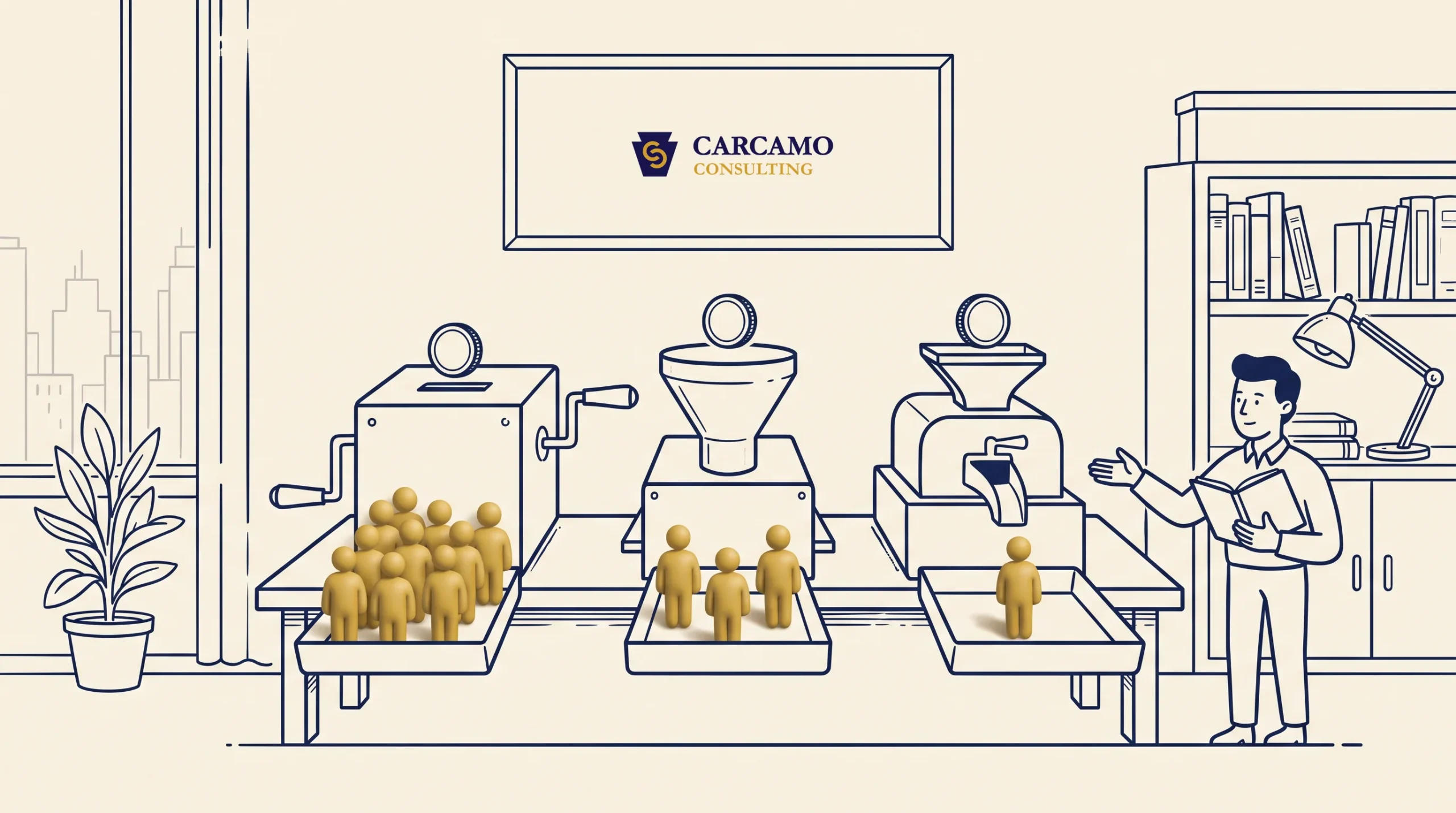
Every extra field on a form is a small tax on the visitor’s patience, and each one raises the odds they abandon it. Research on this is consistent: forms with three to five fields convert meaningfully better than forms with ten or more. Cutting a form from eleven fields down to four can more than double completions in some studies.
For a first contact form, you typically only need:
- Name
- Email or phone number
- What they need help with
Everything else, budget, timeline, company size, can wait until the actual conversation. If the information isn’t needed to start the conversation, it shouldn’t be on the first form.
This is also where a lot of small businesses miss an easier win entirely: giving visitors something valuable enough to trade their contact information for, rather than asking them to commit to “contact us” cold. Lead magnets that turn website visitors into leads covers how to build that kind of low friction first step, which often converts at a far higher rate than a plain contact form ever will.
Trust Signals: Why Visitors Hesitate Before Reaching Out
A stranger landing on your site has no reason yet to believe you’ll deliver. Trust signals close that gap:
- Real contact information. A physical address and a phone number reassure visitors there’s an actual business behind the site.
- Specific testimonials and reviews, ideally with real names, not vague praise like “great service.”
- Recent activity. A blog with a 2022 last post, or reviews that stopped coming in months ago, quietly tells visitors the business might not be very active.
- Clean, professional design. Visitors judge credibility within seconds, and a site that looks dated or cluttered undercuts everything else on the page.
None of this requires an expensive rebuild. Adding two or three specific, recent reviews near your contact form usually does more for conversions than a full redesign.
Speed and Mobile: The Basics That Still Decide Everything
A site that takes more than three seconds to load loses over half its visitors before they see a word of your content. Since most local traffic now comes from phones, mobile performance carries more weight than desktop.
Quick checks that catch most problems:
- Are your images compressed, or are you uploading full size photos straight from a phone?
- Does the site look and work correctly when you view it on your own phone, not just your desktop?
- Are buttons big enough to tap without zooming in?
- Can a visitor tap the phone number on your site and have it start a call, instead of just displaying as plain text?
These are usually quick fixes, not redesigns, and they’re worth checking before you touch anything else on this list.
The Follow Up Problem: Where Conversions Actually Die
A visitor filling out your form isn’t the finish line. It’s the start of a countdown. Businesses that respond to a new lead within the first few minutes convert dramatically more often than those that wait hours or days, because in most local markets, that visitor is contacting more than one business at the same time. Whoever responds first usually wins the job.
This is also where it’s worth being honest with yourself about what “losing customers” actually means for your business. A website conversion problem and a sales conversion problem look similar from the outside, both show up as low numbers, but they aren’t the same thing, and they don’t get fixed the same way.
If your site is generating real inquiries but they still aren’t turning into paying work, the leak has moved further down the funnel. Why you’re getting leads but no customers is the piece to read next: fixing your homepage won’t solve a follow up or closing problem, and fixing your follow up won’t solve a homepage nobody understands.
Where to Start This Week
You don’t need to fix everything at once, and trying to usually means nothing gets finished. Work in this order:
- Run the five second test on your own homepage this week. If people can’t answer what, who, and what’s next, fix that first; nothing else on this list matters if visitors don’t understand what you do.
- Count your form fields. Cut anything that isn’t strictly needed to start a conversation.
- Check your call to action. Make sure it’s visible, specific, and repeated if the page is long.
- Add two or three real, recent testimonials near your contact form or CTA.
- Time your own follow up on the next few inquiries that come in, and see honestly how fast you actually respond.
Fix those five, in that order, before you spend a dollar on more traffic. A site converting at 1% that gets fixed to convert at 3% has effectively tripled the value of every visitor you already have, at no extra cost per click.
Frequently Asked Questions
What is a good conversion rate for a small business website?
Most small business websites convert between 1% and 4% of visitors. For a service business, 3% or higher on form submissions is strong, and 5% or higher on a single offer landing page is excellent. The most useful benchmark is your own trend over time: whether you’re converting more visitors this month than last month.
Do I need a new website, or can I fix the one I have?
Most conversion problems don’t require a rebuild. The biggest issues are usually unclear messaging, a weak call to action, a form that asks too much, or slow follow up, all of which you can fix on your existing site without starting over.
What should I fix first if I only have time for one thing?
Start with your homepage’s clarity. If a visitor can’t tell what you do, who it’s for, and what to do next within five seconds, no other fix on this list will matter, because they’ll leave before they ever see it.
How many fields should my contact form actually have?
Three to five fields is the sweet spot for most first contact forms: name, and either email or phone, plus what they need help with. Every additional field costs you completions, so save anything else for the actual conversation.
How long does it take to see results after making these changes?
Some fixes show up almost immediately. A shorter form or a faster follow up can lift conversions within days. Bigger changes, like rebuilding trust signals or testing a new homepage headline, usually take a few weeks to measure properly since you need enough visitors to see a real pattern.
 Previous